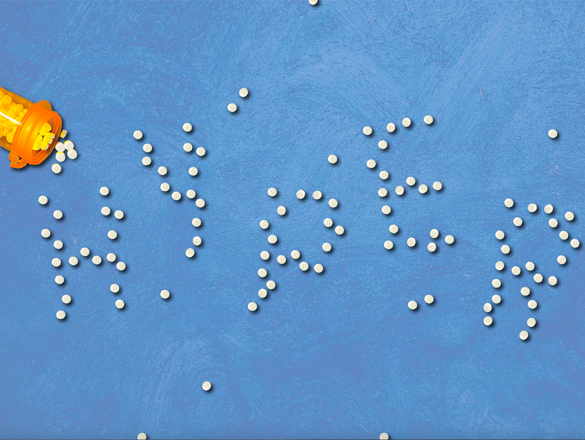
This project explores the expressive potential of typography by showcasing type through creative and unconventional forms. The first piece uses an arrangement of pills spilling from a prescription bottle to spell out the word “HYPER,” suggesting themes of energy, medicalization, or hyperactivity. The tactile, physical nature of the type challenges traditional digital representations and conveys a strong conceptual message.
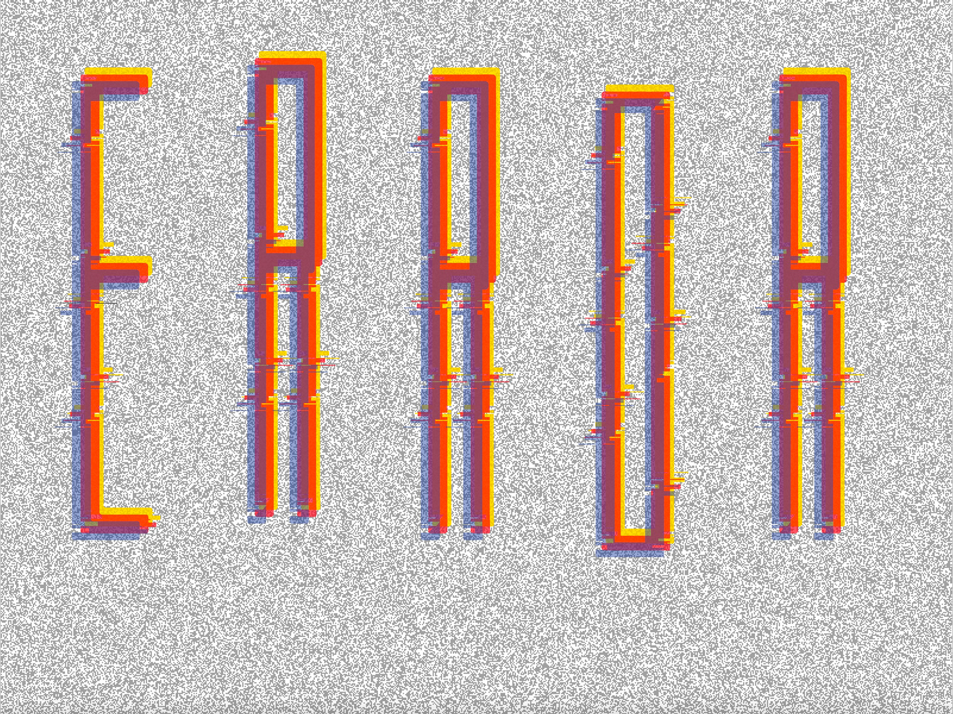
The second piece utilizes glitch-inspired aesthetics to form the word “ERROR.” The letters are constructed with overlapping, offset shapes and vibrant colors, evoking digital noise or malfunction. This design emphasizes distortion and layered visual complexity, reinforcing the conceptual link between form and meaning.