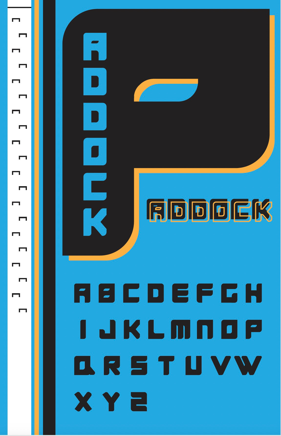
The reflection process for creating the “Paddock” typeface is deeply connected to the journey of translating the essence of Formula 1 (F1) into a visual language. The typeface draws inspiration from the speed, precision, and power inherent in F1, focusing on these elements to create a design that is both sleek and impactful. The process began with a clear conceptual foundation—capturing the aerodynamic efficiency, technological sophistication, and aggressive power of F1 cars. This inspiration led to the development of a bold, geometric sans-serif base, infused with stylistic elements like curved corners and cutouts to echo the streamlined design of F1 vehicles. Each design step was intentional, from sketching wide, bold letterforms to incorporating dynamic slants and negative space. The process required careful attention to balance and consistency, ensuring that every letter not only embodied the spirit of F1 but also maintained legibility and visual harmony.
The introduction of subtle textures and slashes further enhanced the typeface’s connection to the high-tech materials and visual energy of F1 racing. One of the key challenges was maintaining consistency across the alphabet, particularly with the curves and edges of the letters. The final product was a typeface that successfully communicated its intended message: a race car-inspired font with authority, strength, and a modern edge. In essence, the creation of “Paddock” was an exercise in precision, much like F1 racing itself. It required a blend of creativity, technical skill, and an understanding of the underlying principles of speed, power, and design efficiency. The result is a typeface that not only looks fast but feels fast—a true reflection of its inspiration.